Client
ParkBee
Deliverables
// UI/UX Design
// Design system
// Signage and print
// Website
// App design
Transforming ParkBee’s Digital Experience
ParkBee was growing fast, but its digital experience was all over the place. When I joined, the website was built on WordPress without a proper CMS, signage was created ad-hoc, and internal tools were designed directly in development—each with its own visual style. This lack of cohesion led to inconsistencies and inefficiencies. My challenge was to create a unified design system, improve the website’s UX, and ultimately define the ParkBee app to provide a seamless and intuitive parking experience.
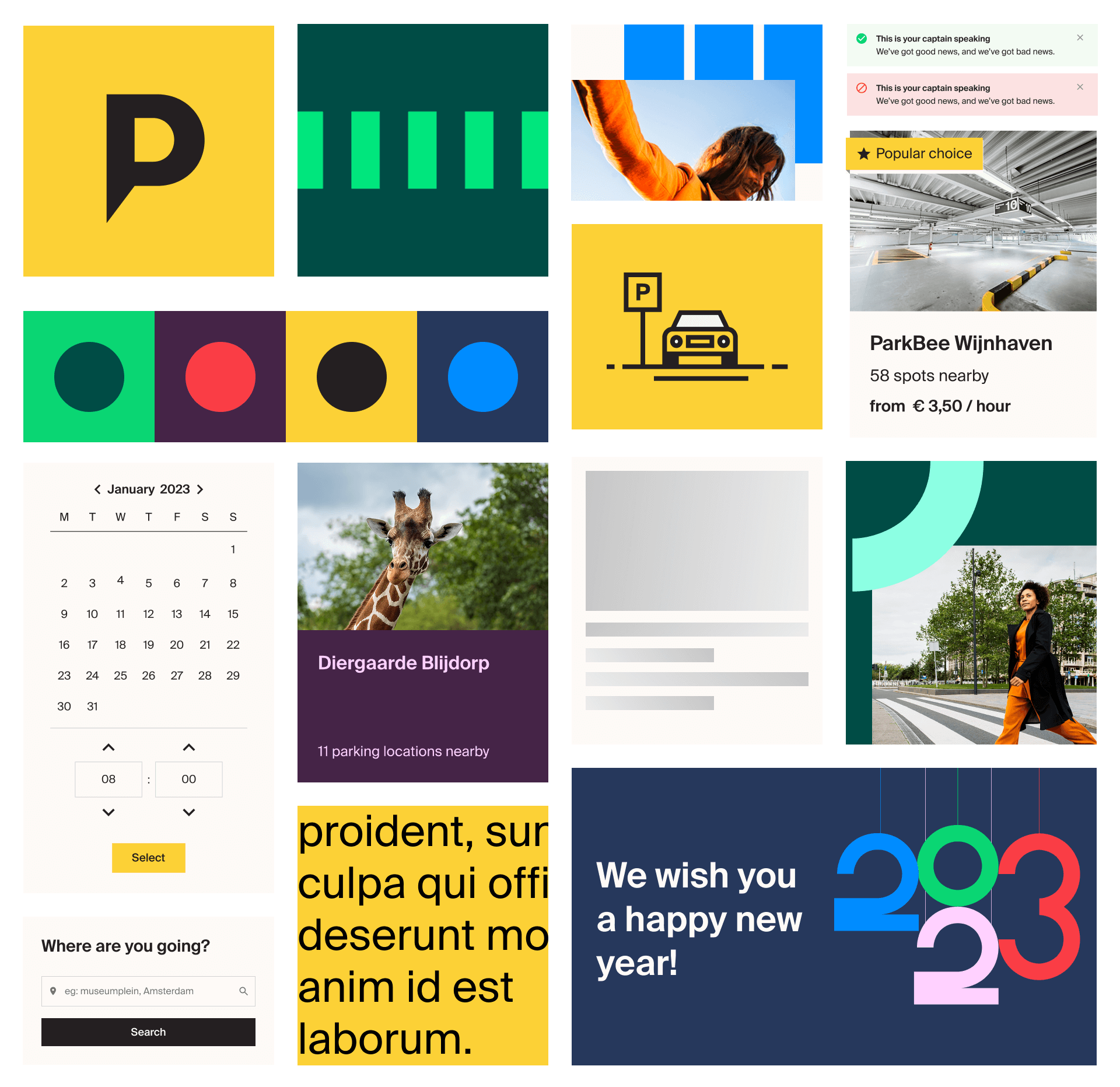
Building ParkBee’s First Design System
I spearheaded the creation of ParkBee’s first-ever design system, providing a scalable and future-proof framework for design consistency. This system established:
- A unified visual language – typography, colors, and components designed for flexibility and accessibility
- Reusable UI components – speeding up design and development while ensuring brand cohesion
- Clear documentation – enabling cross-functional teams to adopt and apply the system efficiently
Redesigning the ParkBee Website
A few design principles to make, discuss and evaluate design decisions.
Parking? Done.
People expect parking to be simple. So ParkBee should feel simple as well – even though we all know it’s quite complex in the background.
Exactly what you need
Delivering the right content to the right people at the right time. By tailoring flows and touchpoints to each individual, ensuring they receive precisely what they need.
It's never really about parking
We aim to make parking effortless, so people can focus on what truly matters—their destination. To do that, we must unify everything related to parking: cities, locations, transportation, technology, and beyond.
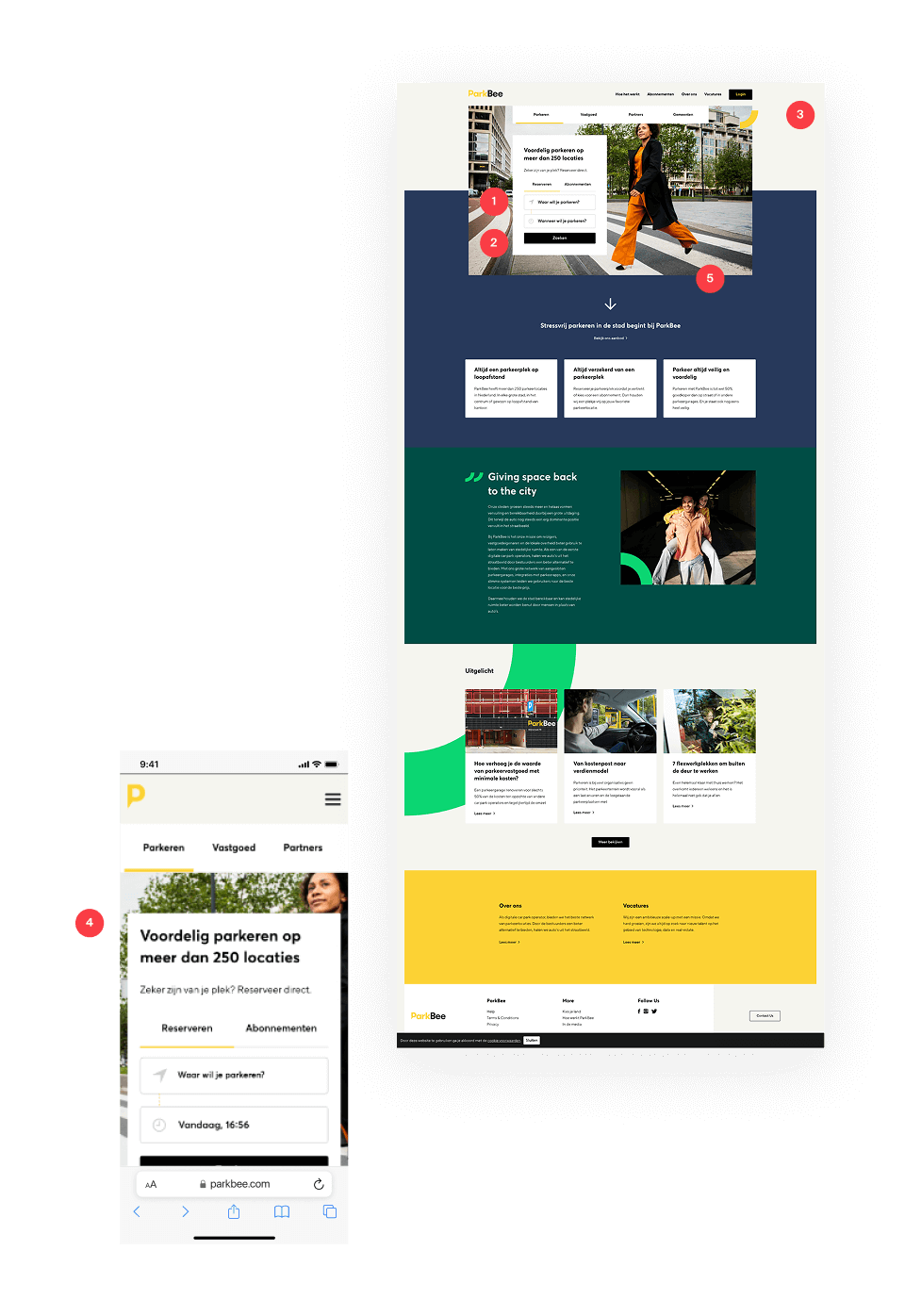
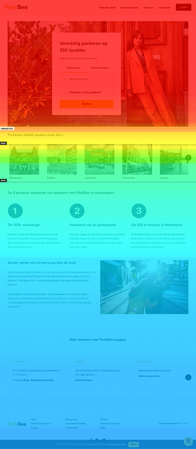
BEFORE
A confusing and uninspiring user experience
- Users were overwhelmed with decisions, leading to confusion and drop-offs.
- Hidden CTA; The primary call-to-action was out of view, reducing conversions.
- Dull and uninspiring design; The website didn’t reflect ParkBee’s vibrant brand.
- Not mobile-friendly; The lack of responsiveness caused frustrating usability issues.
- Lack of clarity; Visitors didn’t immediately understand what ParkBee offered or how it worked.
AFTER
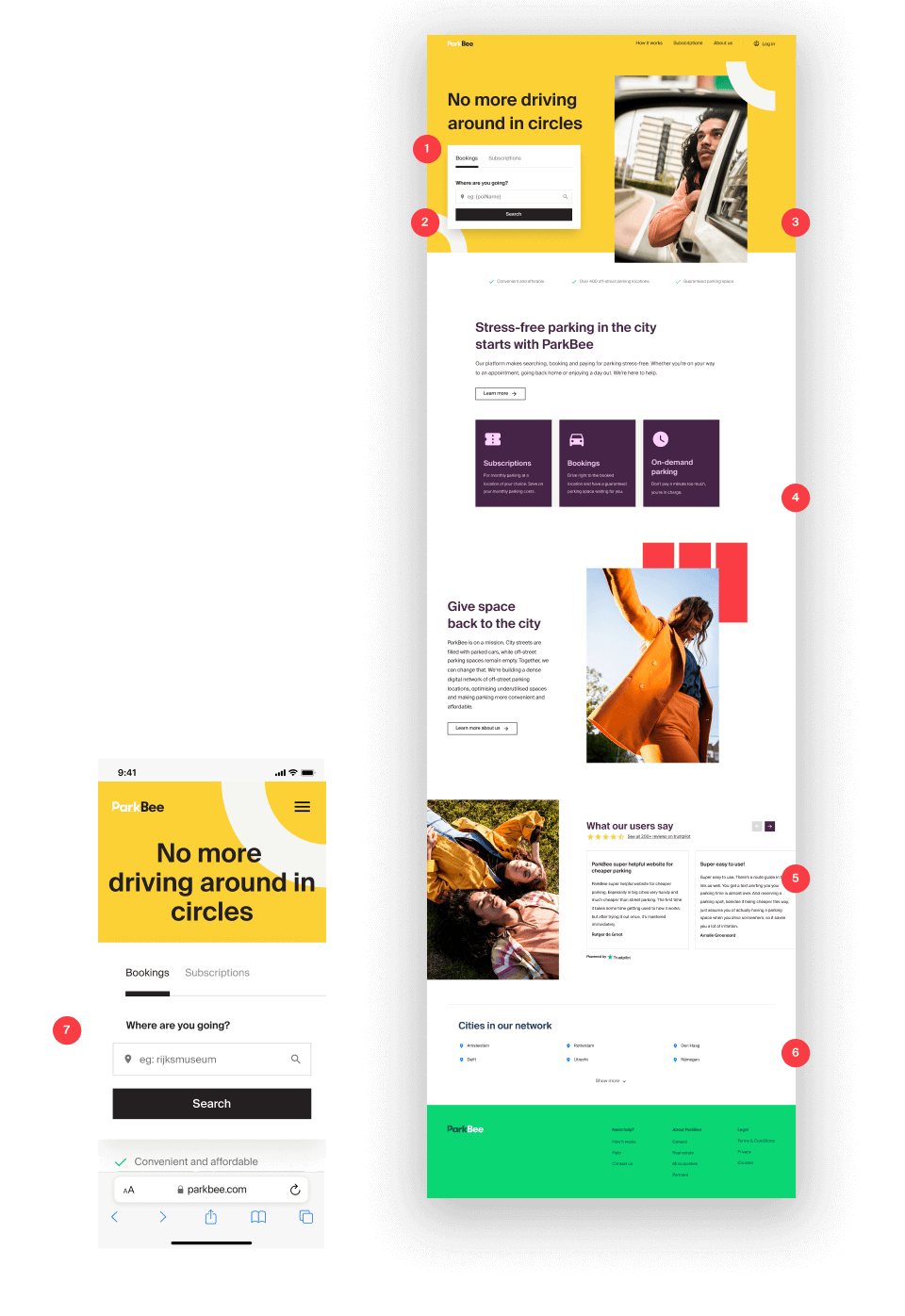
A seamless, engaging, and user-friendly experience
- Streamlined decision-making
A simplified user flow guides visitors effortlessly - Prominent CTA placement
Key action are always in view, improving conversions - Vibrant brand experience
A new energy and consistency to the platform - Clear brand messaging
Users understand what ParkBee offers and how it works. - Building credibility
Reassuring users about the quality of the service. - SEO optimized
Structure and content are tailored for better search engine visibility, driving organic traffic - Fully responsive design
A smooth experience across all devices
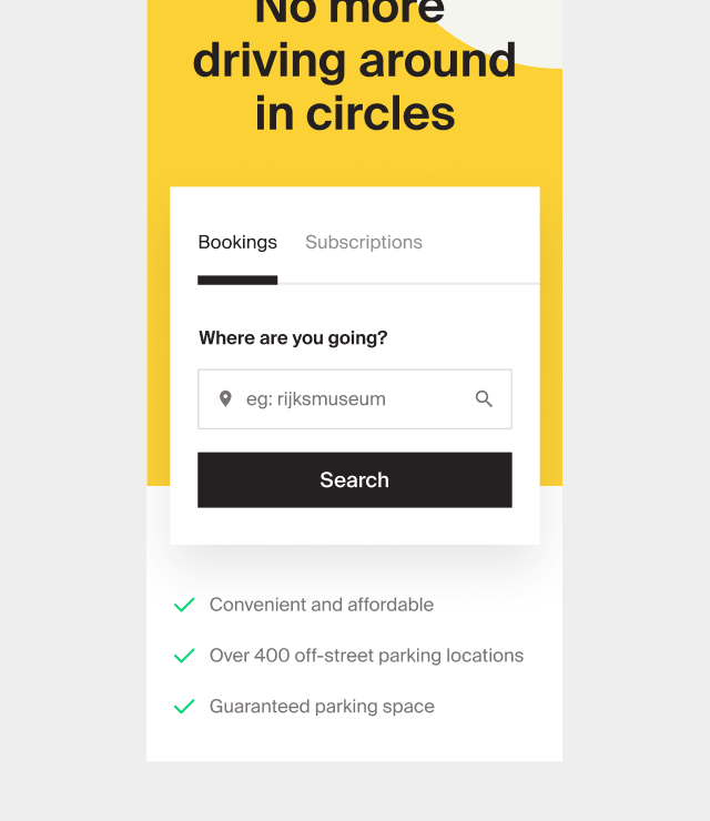
Guiding users smoothly from discovery to booking
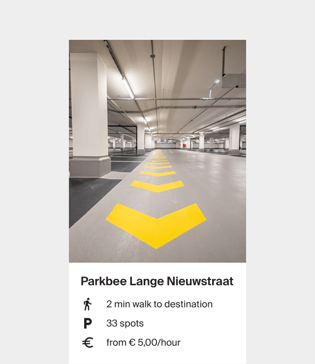
Tailored results based on user needs to optimise conversion
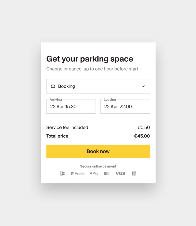
Making parking reservations as seamless as possible
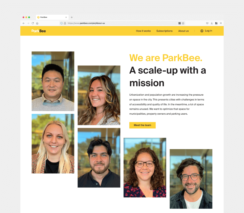
Maintain harmony between ParkBee’s vibrant branding
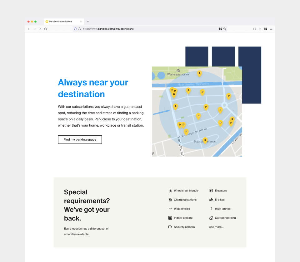
And clear, practical information
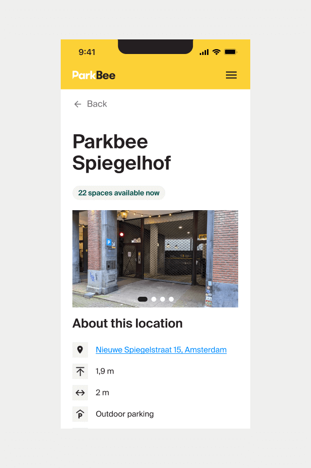
Find a spot based on specific needs and desired amenities
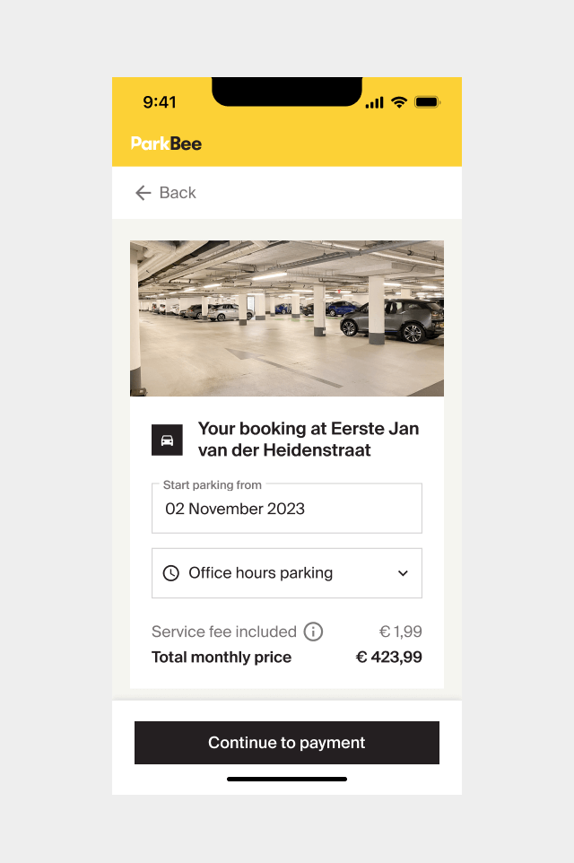
Quick and intuitive booking process to minimize friction
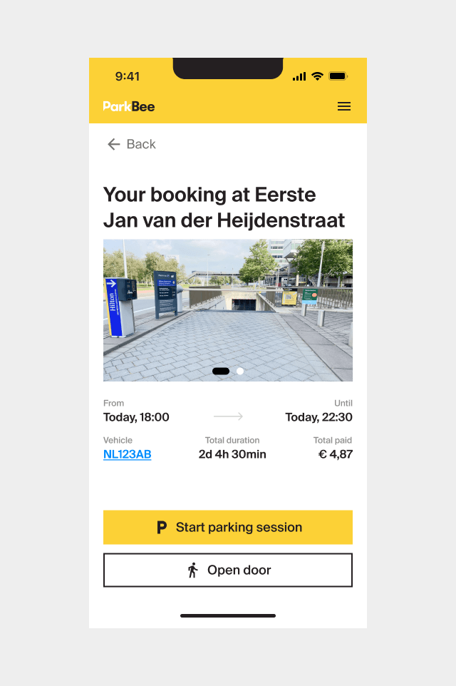
Clear instructions to ensure stress-free access
BOOST CONVERSION
Optimising landing pages to boost conversions
• About 80% of all landing page visitors are new users
• Most users land on the landing pages through Paid Search or Organic Search
• Users who perform a site search are more likely to convert than those who don’t.
• At the time, around 34% of users are not performing a search
Hypothesis
Simplifying the search module will encourage more users to engage with it, resulting in a higher prepaid conversion rate.
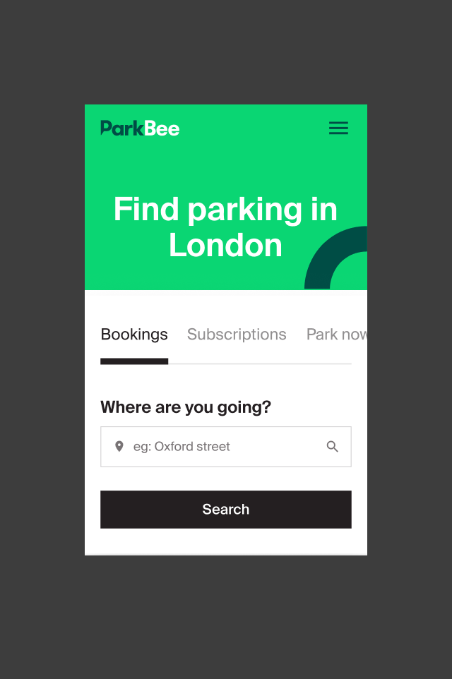
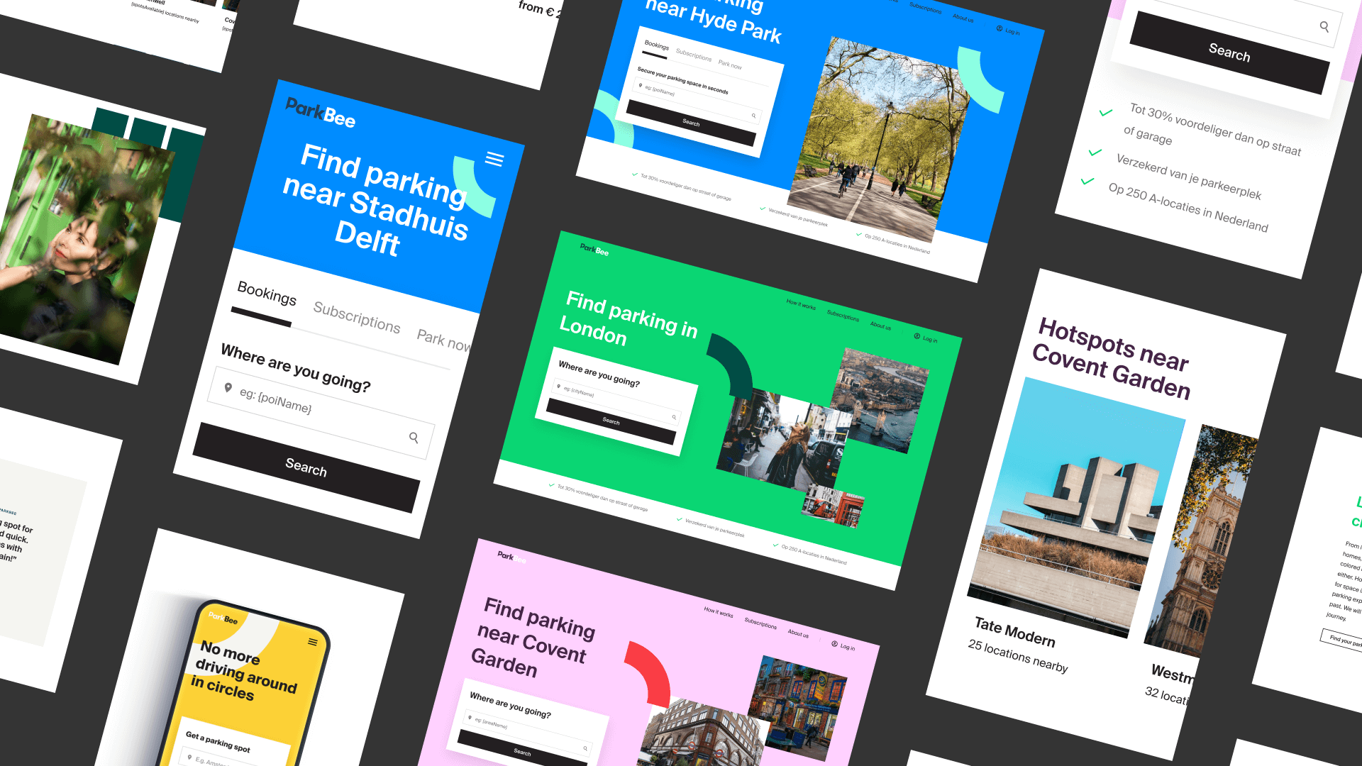
Search for parking in a city
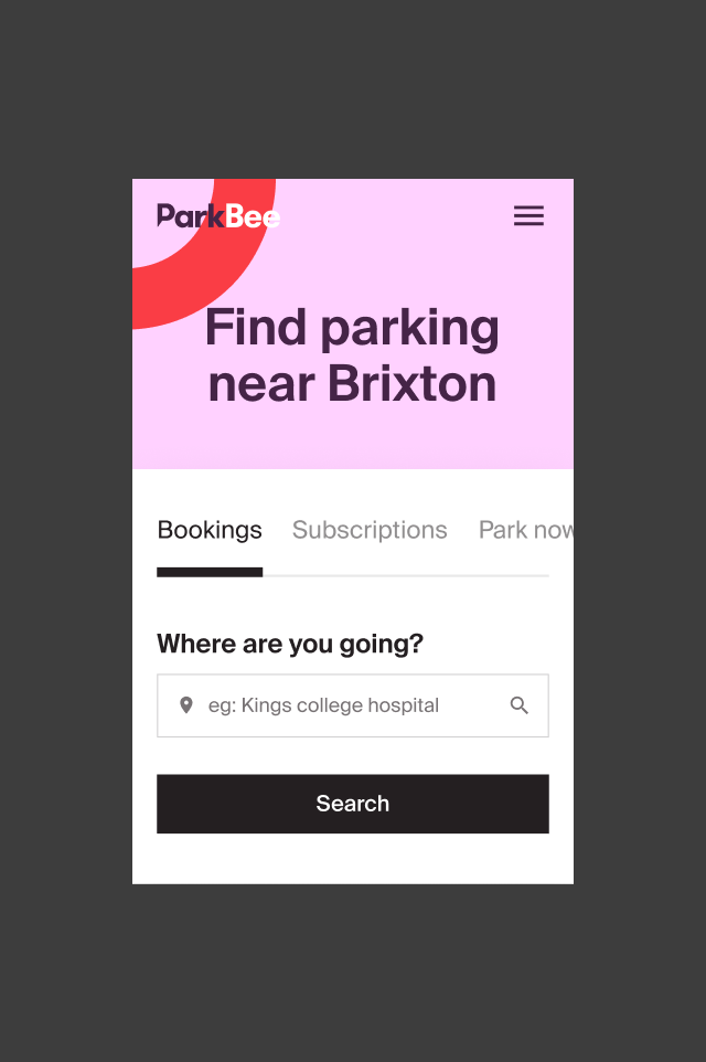
Search parking in an area
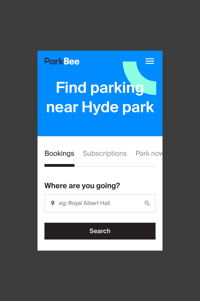
Search parking near a point of interest
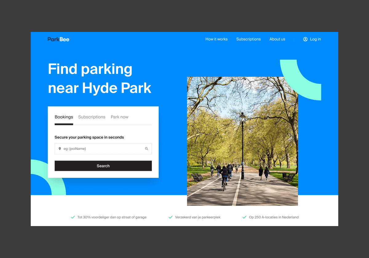
Building confidence by making every visit feel familiar
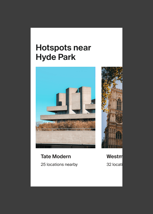
The best parking spot near your destination
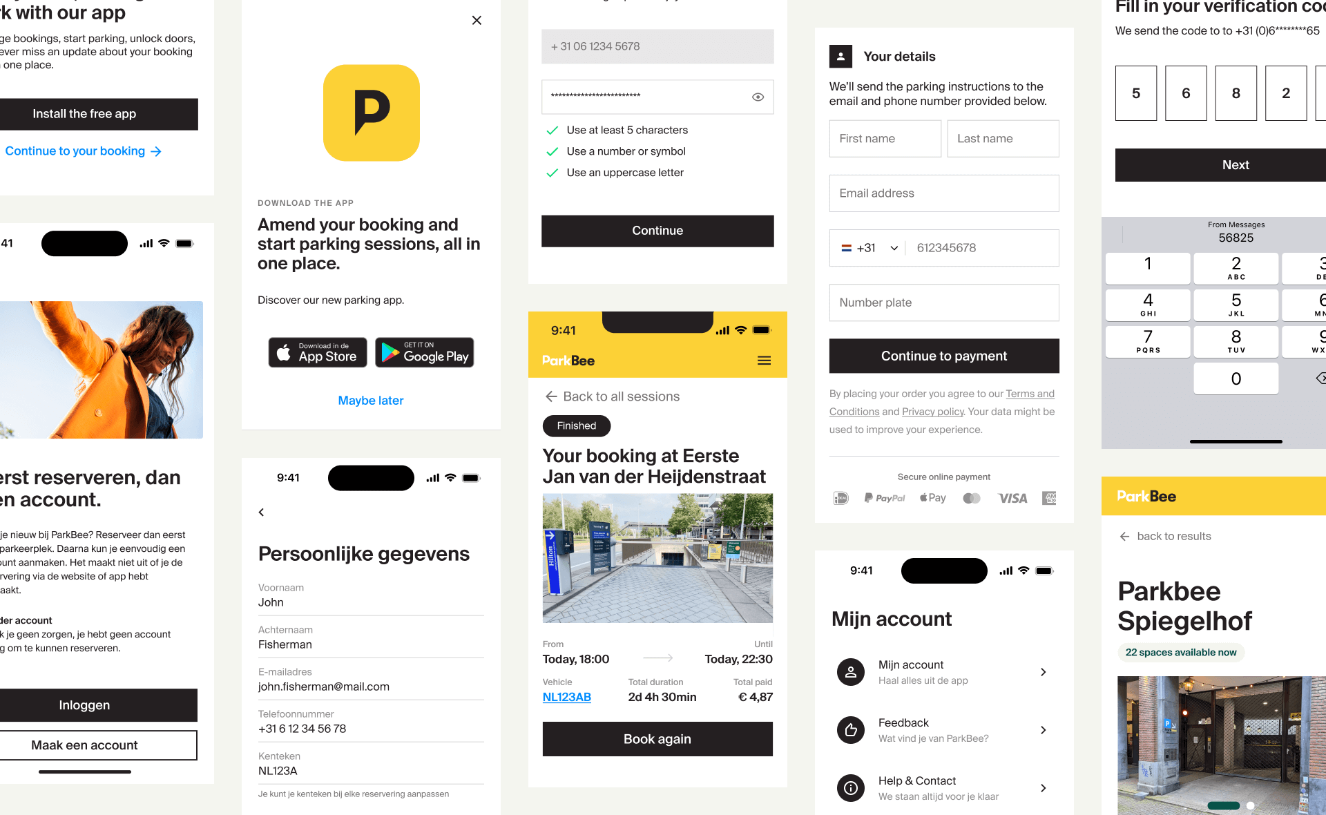
Leading the app design
Eventually, I took sole responsibility for the ParkBee app’s design, aligning it with the design system and improving the user experience. Key improvements included:
- A streamlined booking flow – reducing steps and enhancing ease of use.
- Improved navigation & accessibility – ensuring intuitive interactions for all users
- Consistent branding & UI components – reinforcing trust and familiarity across platforms
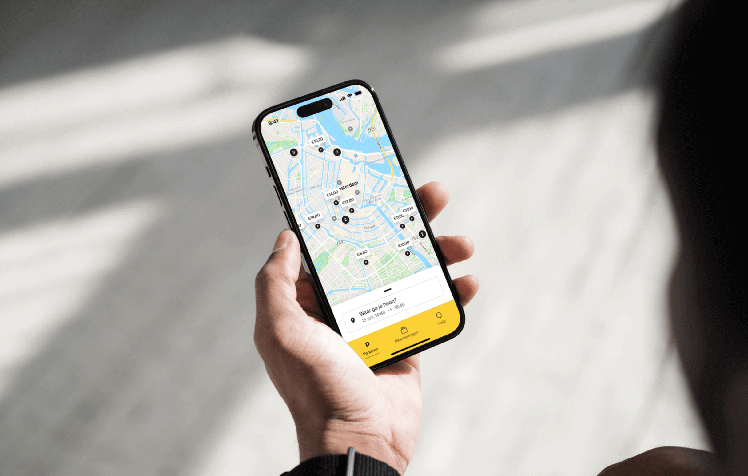
Why did ParkBee need an app?
Users needed a faster, more effortless way to find and book parking, but the web experience fell short. Both frequent visitors and new users found it frustrating to rely on the website for every booking. As demand grew and stakeholders pushed for a solution, one thing became clear—ParkBee needed an app, and it needed to be built fast.
THE STARTING POINT
Delivering a fully functional,
user-friendly app —from scratch.
- Zero groundwork: No previous designs, development, or infrastructure in place
- Tight deadline: No room for delays
- High expectations: Stakeholders expected a polished, scalable, and intuitive app
- Cross-team collaboration: Coordinating between design, development, and business teams under tight constraints
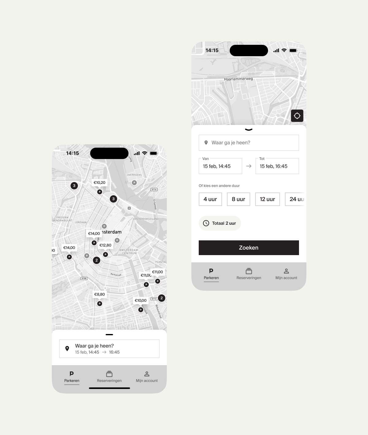
APPROACH AND PROCCESS
Rapid iterations, constant testing, and close team alignment
- Defining core functionalities to ensure a launch-ready product
- Despite time constraints, ensuring usability and intuitive navigation
- Balancing business needs with technical feasibility.
EXECUTION & KEY FEATURES
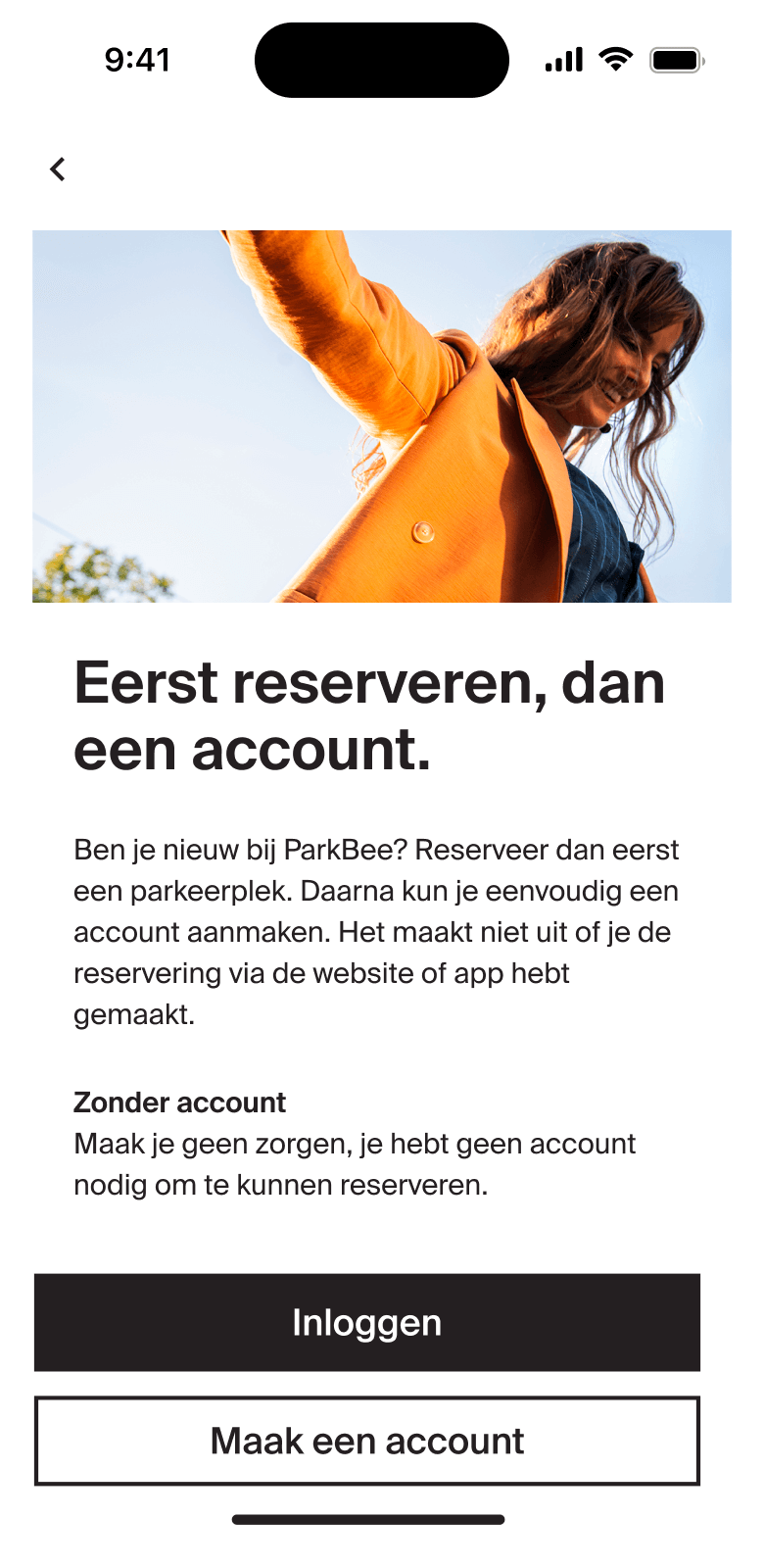
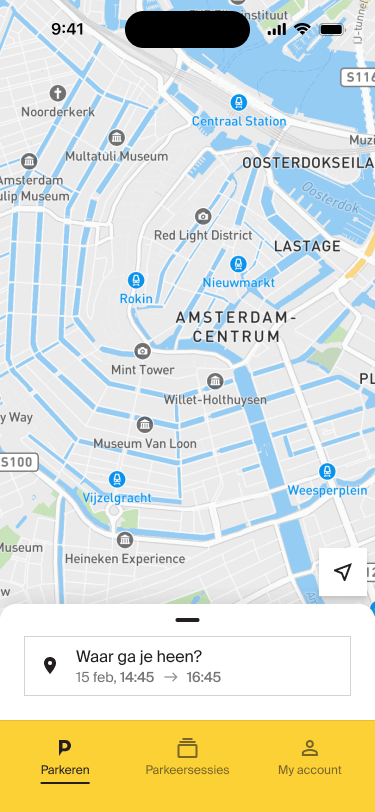
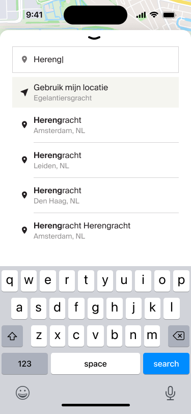
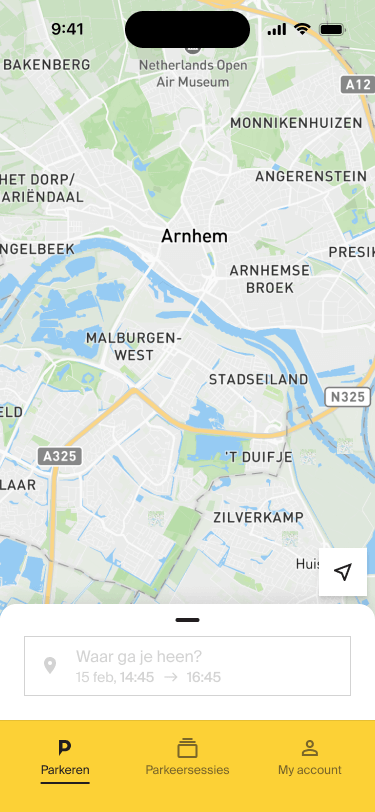
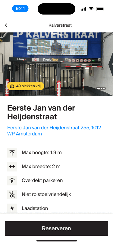
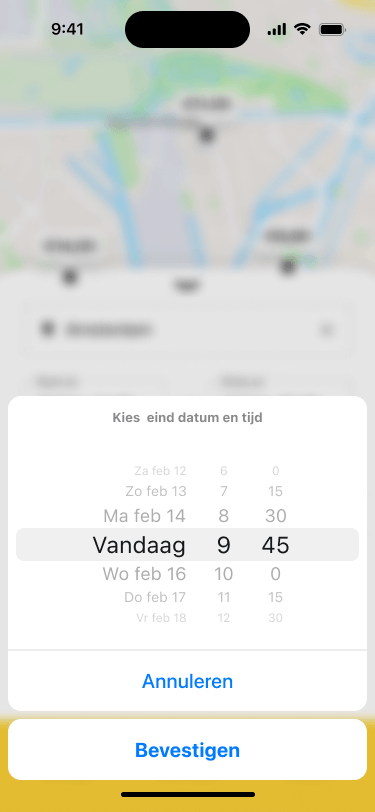
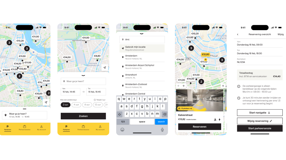
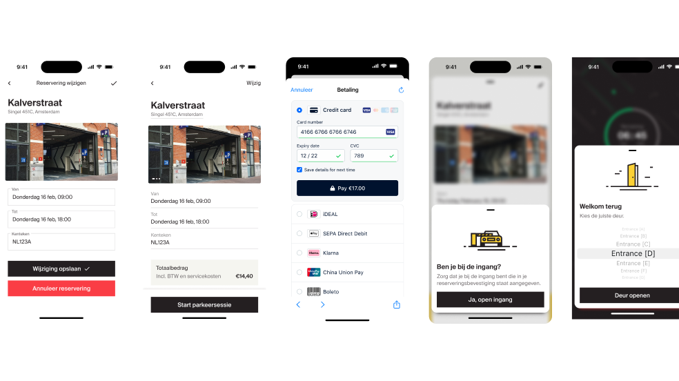
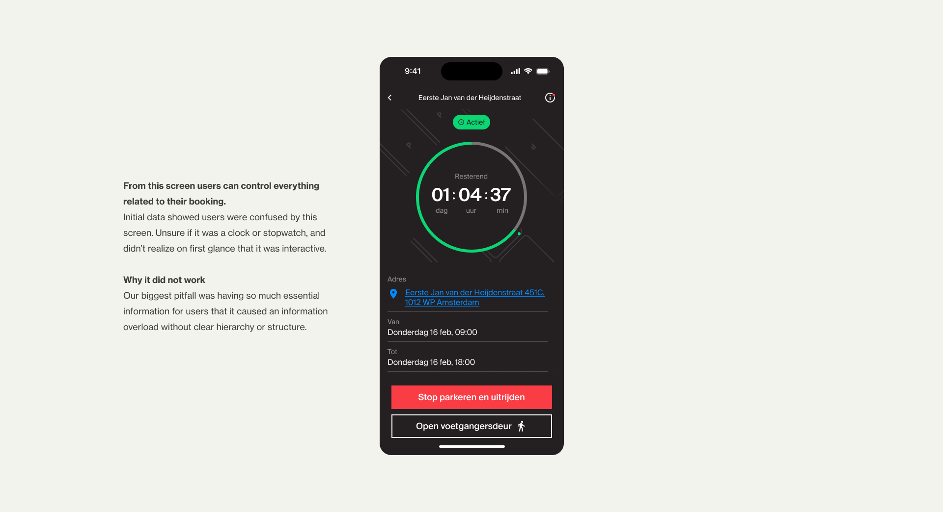
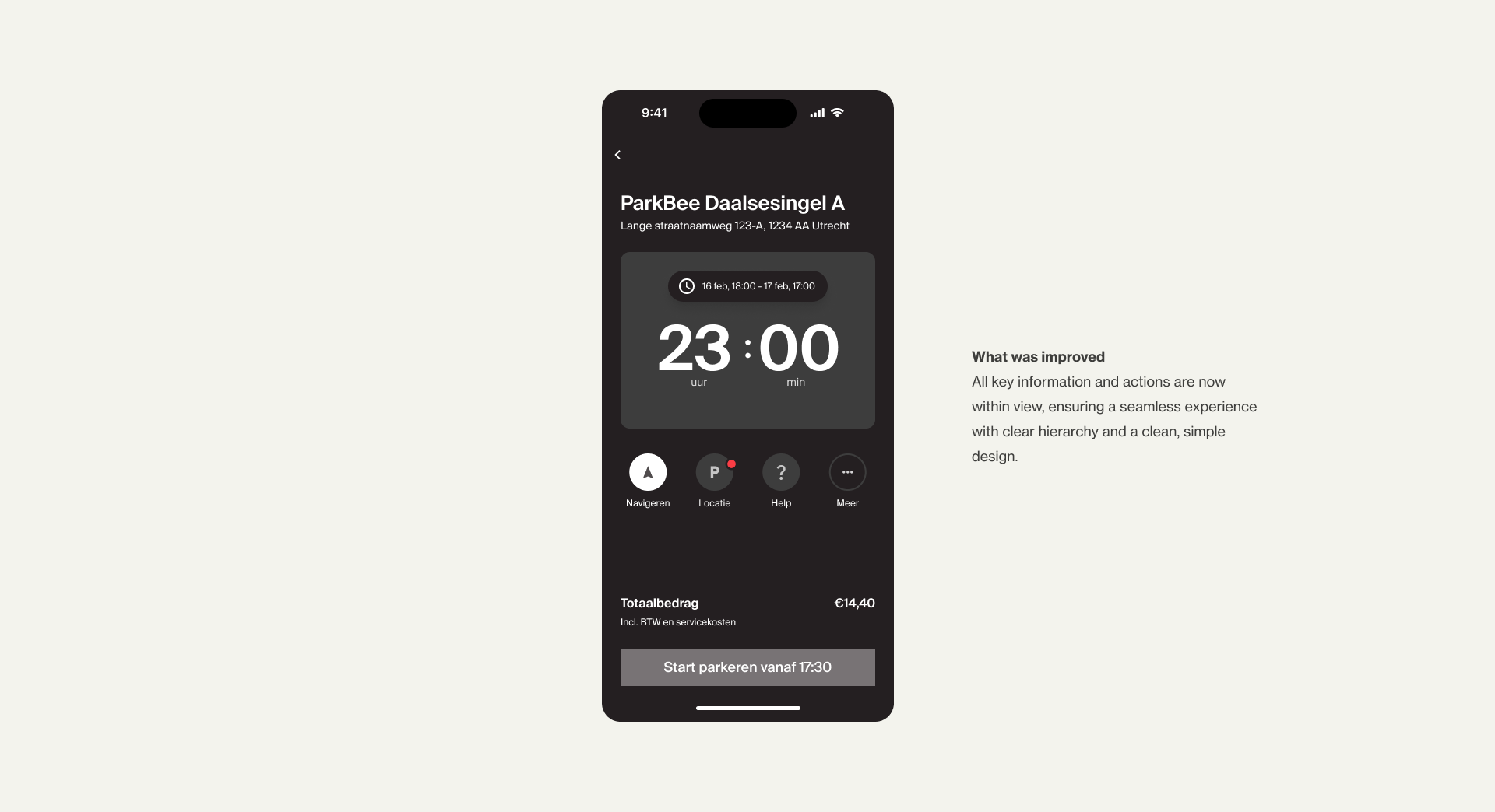
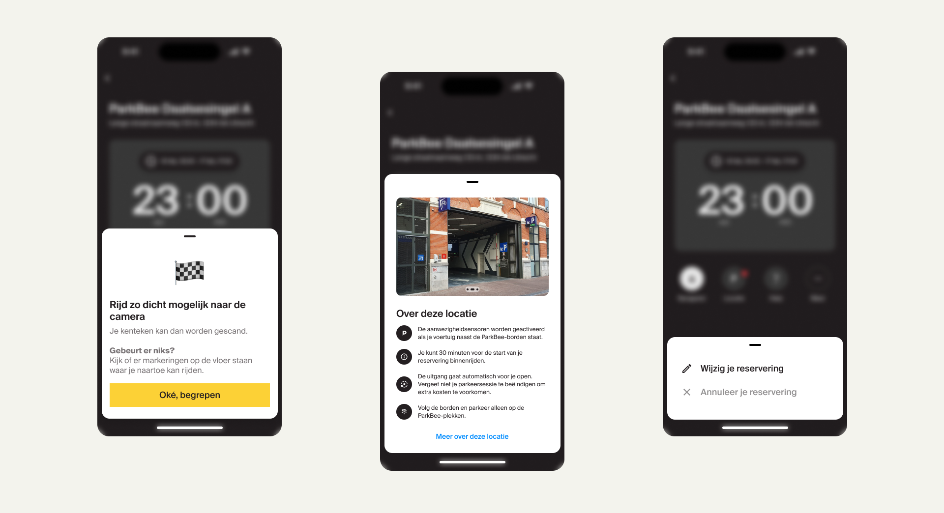
Seamless parking experience from search to booking to parking.
From the moment users search for a spot to the final checkout, every step needed to be fast, intuitive, and frictionless. To achieve this, we streamlined the user flow, ensuring a smooth transition from discovery to booking without unnecessary steps.
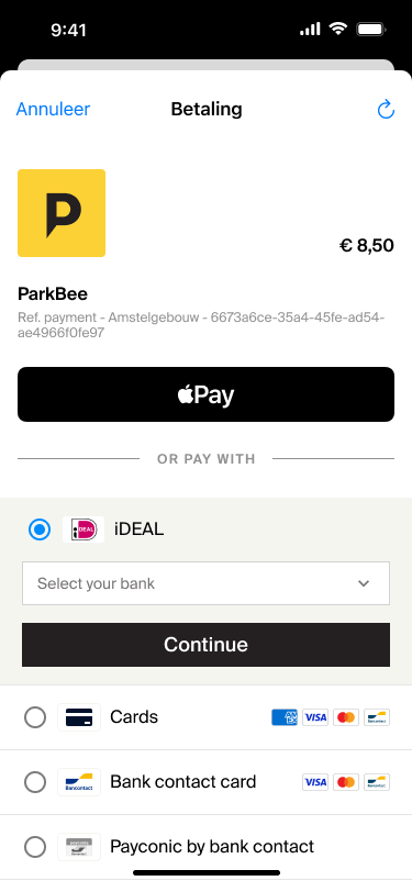
Frictionless checkout was a key priority, allowing users to complete their transactions effortlessly. Throughout development, we conducted real-time user testing, refining interactions and eliminating roadblocks to create an experience that feels simple, fast, and frustration-free.
THE OUTCOME
A fully functional ParkBee app in just 3 months
Early data showed strong user adoption, with high engagement and an intuitive flow that made booking effortless. Just five months after launch, ParkBee ranked #5 among the most downloaded apps in the Netherlands, proving the demand for a smarter parking solution.
And from this point...the real work begins...
With the MVP launched, we could finally shift our focus to real growth. Armed with initial user data and feedback, I began identifying opportunities for optimization, laying the groundwork for future improvements
MY ROLE
Ensuring a high-quality, user-centered experience across all digital touchpoints.
I took the lead in building ParkBee’s first-ever design system, was responsible for the website’s UX/UI, and later became the sole designer of the ParkBee app.
10%
boost in website conversions
-65%
calls to customer support
#5
most downloaded app in NL
